Additional data on historical housing prices
Analyzing Silicon Valley, Seattle and Miami prices, as well as single-income households.
I’ve received a few comments from helpful critics on my last post about historical housing prices and wanted to write a follow up to address those. If you haven’t read it, check it out first for context on what I’m talking about here.
How many homes in 1980 were bought on a single income where in 2022 are bought with dual income?
When we think about the 60s, something akin to Mad Men pops up in our head, with the husband taking the train to work every day while the wife stays at home to take care of the kids. This is juxtaposed to the modern age where both parents have to work to put food on the table and children are sent out to daycare instead. Let’s take a look at the data to see if it’s true. The following datasets seemed the most relevant:
Median personal income, 1974 to 2020. This dataset would’ve been sufficient, but I was hoping to find something going back to the 1960s.
Disposable personal income per capita, 1947 to 2022. This dataset takes the total after-tax income of every adult in America and divides it by the total adult population. This effectively turns this into an “average” metric rather than a “median”, so it wouldn’t be optimal to use.
Real Median Earnings of Full-Time, Year-Round Workers, 1960 to 2020. This table splits the data by gender, which is perfect as this lets us check how much worse off a household would be today if only the husband is employed.
Adjusting dataset #3 by CPI-U-RS, we can generate the ratio between male and household incomes since 1963:
In 1963, full-time income of the median male worker represented 93% of the median household income. By 2022 this decreased to 73%, therefore showing that single-earner households are indeed becoming more rare. This is corroborated by data from BLS, which track the share of wives earnings as a percentage of family income:
The BLS chart is showing different numbers because the two datasets are answering two separate questions:
The Census data (first chart) answers “if only the husband works in the family, how much worse off is the family going to be?”
The BLS data (second chart) answers “what is the share of wives earnings in the incomes of American families?”
In some families, only the wife works (6.8% of families as of 2011). In others, both work but the husband works less hours thanks to the dual income, etc. So overall the two charts can be expected to show us different data with a similar trendline. We can now use the Census data to generate a chart of mortgage affordability for the median single-earner household:
This version of the chart peaks in 1981 (just like the family income version) and doesn’t look extreme in 2022 compared the the last 3 decades. Obviously it’s harder to sustain a mortgage on a single income than on a dual income, but it’s still more affordable than in the 1980s. However Don Draper would’ve indeed had a much easier time getting that house in Westchester County back in the 1960s.
In 1981 home prices were a fraction of what they are today, but the mortgage rate exceeded 18%. And while some places had higher home prices than others, the high monthly cost was mostly attributable to the high mortgage rate, which applied across the nation. Today, the difference in home prices across regions is enormous, with home prices in Florida, Boston, Charleston, and certain other places doubling in a couple of years while home prices in many places flat or falling.
This comment points out that while the “median” home might be more affordable than in 1981, if we look at the most popular metro areas we’ll see a completely different picture. Let’s start with Seattle/King County where I live. Thanks to Boeing, Microsoft and Amazon it’s been one of the fastest growing counties in America. FRED has data for King County’s median income and household price index, allowing us to generate an affordability chart since 1975. Since FRED doesn’t give us raw dollar figures for King County’s listing prices, I took $880k (median sale price in Apr 2022) as the baseline for 2022 and generated a price-to-income graph for the past 3 decades:
Once again 1981 was the worst year for new home owners (67% spent on annual payments), followed by 2006 (at 55%). Things are trending upwards in 2022 (at 46%) but still not the worst time period in King County history, although increasing mortgage rates could eventually take us there. Now let’s do Dade County (Miami) and see if Tony Montana had an easier time buying properties back in the 80s, using equivalent datasets from FRED and $475k as the baseline median price in 2022.
The 1980s were once again the worst time for new home owners in Miami (81% spent on mortgage payments), with the second peak in 2006 (at 61%). 2022 actually looks pretty good in comparison at 43%. Miami’s data is probably somewhat distorted by people purchasing property there on incomes from other states, which would explain why it’s more unaffordable for locals than other places. So unfortunately Tony Montana would’ve been in a tough spot if he continued with the dishwasher career path, instead of switching to more lucrative enterprises.
Now let’s take a look at Santa Clara county in California, which is home to a large chunk of Silicon Valley. Would Steve Jobs have an easy time buying a house if Apple fizzled out back in the day? The current median house in Santa Clara is sold for a whopping $1.6m, which gives us the following chart when combined with FRED data.
Ouch! Both 1981 (at 93%) and 2006 (at 87%) were a horrible time to become a homeowner, assuming you’ve earned the median income for the county. But 2022 is still not at the level of those peaks (at 61%), despite a very high sticker price on the median home. So its very unlikely Steve Jobs would’ve been able to afford anything in Palo Alto as an average employee.
The first payment amount might be high but it becomes nominal quick thanks to inflation. So you should calculate the % of income spent in year 5 of the mortgage, rather than in the very first year. Plus people taking out a mortgage in 1981 would’ve refinanced their loans later on.
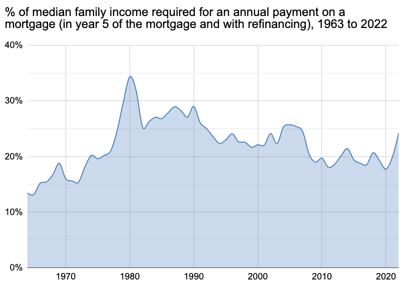
This is a fair point, though arguably those first few years are still a big problem for new home owners, as you still have to give up a large chunk of your income at first due to high interest rates. We can generate an updated version of the graph from the previous post, assuming that you’ll also complete a refinance in year 5 if lower interest rates are available. So i.e. a person taking out a loan in 2020 at rock bottom mortgage rates would not get refinancing, but someone taking out a loan in 1981 would at some point. Since we don’t yet have data for median household incomes in 2023-2025, I’ve assumed they would grow by 3% per year in nominal dollars.
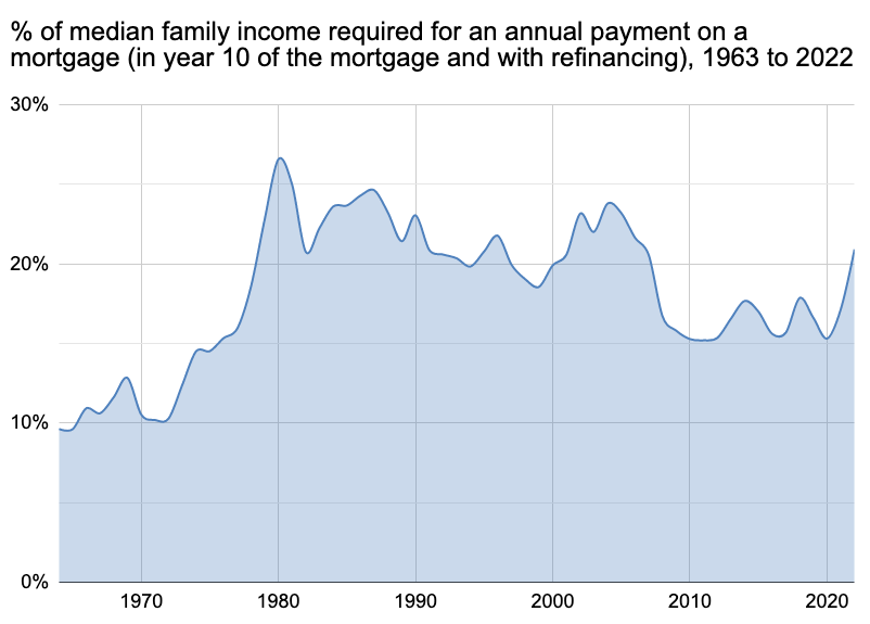
This graph shows that mortgages are indeed much more affordable by year 5 and the worst year for new home owners is now 1980 (at 34%), as lower interest would not have been available to them until 1985. 2006 now peaks at 26%, while 2022 peaks at 24%. So even with refinancing and even if future inflation is taken into account, we’re still not at the worst point in history. But what about year 10? Perhaps after a decade 2022 home owners will feel like they’ve got a bad deal compared to their predecessors? I’ve once again presumed nominal household incomes will grow by 3% per year on average.
In this scenario the worst year is still 1980 (at 27%), followed by 2004 (at 24%) and then by 2022 (at 21%). The caveat of course is that this presumes a 3% growth in nominal wages over the next decade and that ‘22 mortgages will never be refinanced as the interest rates won’t go lower than they are today. This graph also shows the beauty of signing up for a fixed-rate mortgage - you get all the upside of potentially reduced interest rates and thanks to inflation your payments will become proportionally cheaper with each passing year.
What about cash buyers? Wouldn’t they suffer from very high prices in 2022?
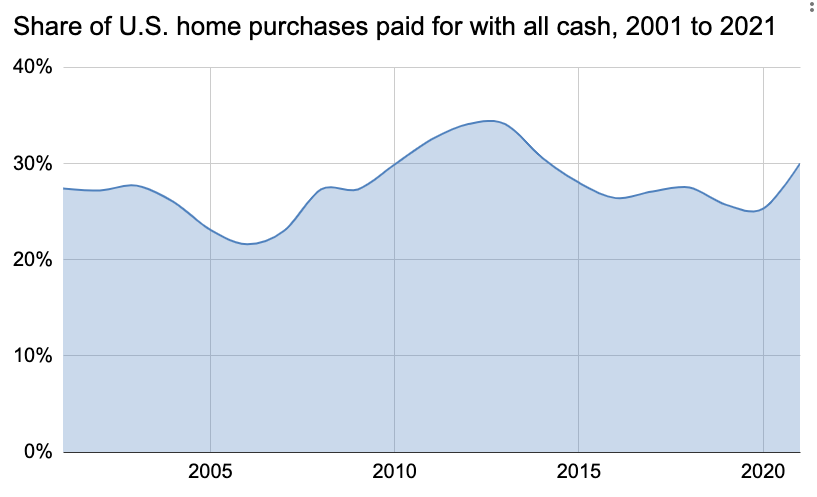
If we look at the latest statistics, on the surface it seems like all-cash offers are quite ubiquitous in 2022:
However we need to differentiate between 3 different types of “all cash buyers”:
People who sell their house first and then buy a different one “all cash”. These would typically be people downsizing to a smaller house or a house in a cheaper location and therefore not needing a mortgage. Since their money comes from another piece of real estate, they’re not particularly affected by the latest price-to-income ratio. On the other hand if they upgrade instead of downgrading, they could just get a mortgage for the missing amount in 2022 and they’d still do just fine.
People who buy “all cash” only on paper, via companies such as Flyhomes that will quickly pay the seller from their own reserves and then wait for your mortgage to finalize so that you could “buy” the house back from them. Home buyers in this group likewise won’t care much about the raw price-to-income ratio.
The top 1% of society, who have enough saved up funds to buy houses without a mortgage. This group was indeed better off in the 1980s, but quite frankly I’m sure they’re not suffering a horrible existence in 2022 either.
This doesn't really seem to capture the problems of affordability, at least as they are experienced the UK and Europe. Here, rent payments are typically maybe 20% or higher than a mortgage payment on the same house, so for anyone who is already renting, the payment isn't what constrains affordability.
Affordability is more constrained by two things: (i) the need for a deposit (downpayment), of 10-20%, which means that a young person needs to find maybe 40k in hard cash to buy an apartment in a city, and (ii) limits on the size of the loan based on income - this is calculated as a percentage of the price, not the monthly repayment, so in terms of mortgage eligibility 2022 is indeed the worst year.
This is a fair point! If the bank requires a 10% deposit to become eligible for the mortgage, a lot of people might never save up enough money to get the mortgage in the first place. And since 2022 has the worst price-to-income ratio in history, it is also the hardest year for those who need to save up the initial 10%. We can see this from a chart showing the number of months of income required to save up for the initial deposit over time, based on Median family income and Median housing prices:
We went up from 2.9 months of savings required in 1970 to 5.6 months in 2022. In reality saving up this much money will take much longer, as families have to take care of taxes, rent, food, and other purchases. George Bush famously tried to address this problem with the American Dream Downpayment Assistance Act, which was one of the contributors to the housing bubbles of the 2000s, so this might be the one stumbling block that the government will refuse to solve and that will remain the biggest barrier to homeownership.


